Case Study · 02
Series Campaign Identities
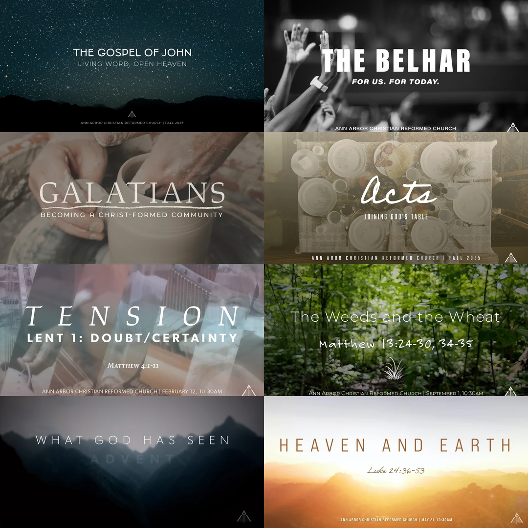
From 2019 to 2025, every teaching series received a complete visual identity, implemented across multiple media including print, digital, and video—designed, produced, and shipped on a recurring institutional cadence. Nine are shown here—the practice ran for years and produced many more. Not one campaign; a sustained creative practice.
The Practice
Agency portfolios show campaigns. This series shows creative deliverability over time, delivered on schedule for years. Each teaching series at AACRC ran six to twelve weeks, and each one got its own identity—distinct enough to feel like a fresh invitation, disciplined enough to read as one institution.
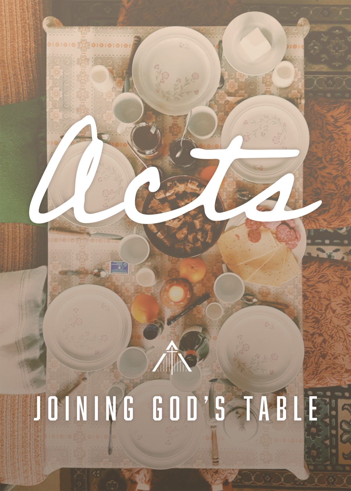
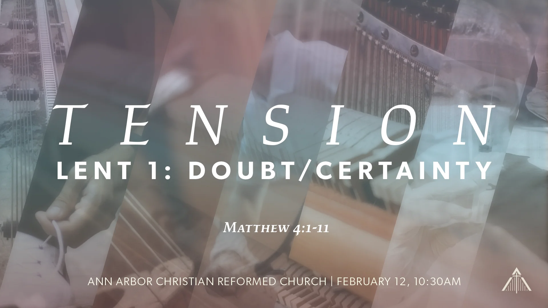
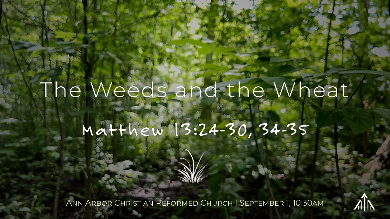
The range was deliberate. Galatians (Fall 2022) built its identity on pottery photography and a humanist serif. John (Fall 2023) went celestial—a star field, thin geometric capitals, an open horizon. The Belhar (2025) used high-contrast black-and-white photography and compressed grotesk type. Acts (2025) softened into a hand-scripted wordmark over a communal table. Tension sliced and layered its imagery behind wide-tracked serif capitals for Lent. Ordinary Time went slow and green—hand-lettering over a single sunlit forest. Advent, Epiphany, and Easter ran one construction across five months while the light steadily rose. Nine series here, nine unmistakably different moods, with one consistent institutional mark anchoring them all.
The Belhar · 2025
The systems test. A multi-week series on the Belhar Confession—a densely theological South African document on reconciliation, justice, and unity—given a single identity that had to flex across four formats: a 6″×4″ postcard, a web banner, a feed thumbnail, and a large-format vinyl banner that had to be legible from sixty feet. I built one modular system that worked across all formats—shared palette, consistent type, a central image treatment that crops and reframes without losing coherence.
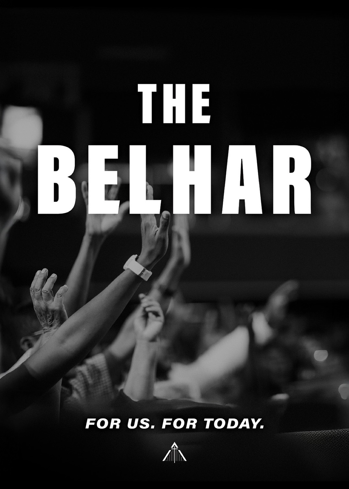
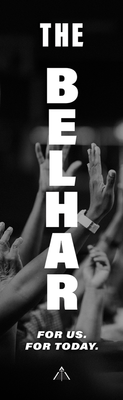
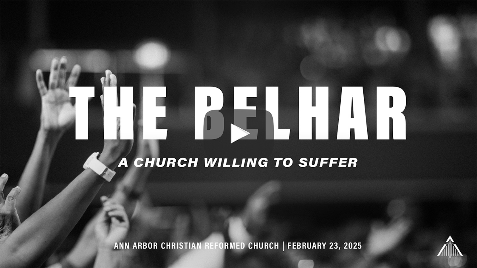
The same identity works in the hand and at sixty feet—essential delivery for this context
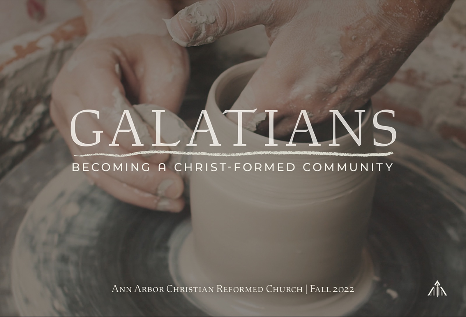
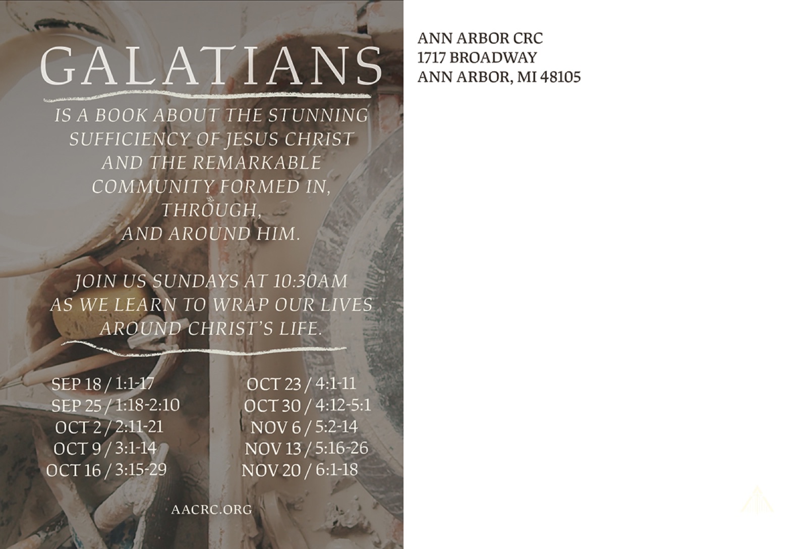
Galatians: Becoming a Christ-Formed Community · Fall 2022
Concept as anchor. The series explored spiritual formation—the slow process of being shaped—so I anchored this identity in the visual of pottery: raw clay becoming a vessel. One coherent image system carried the idea from the mailer to the screen, and into a five-minute countdown film with an original score—watch it on the video page →
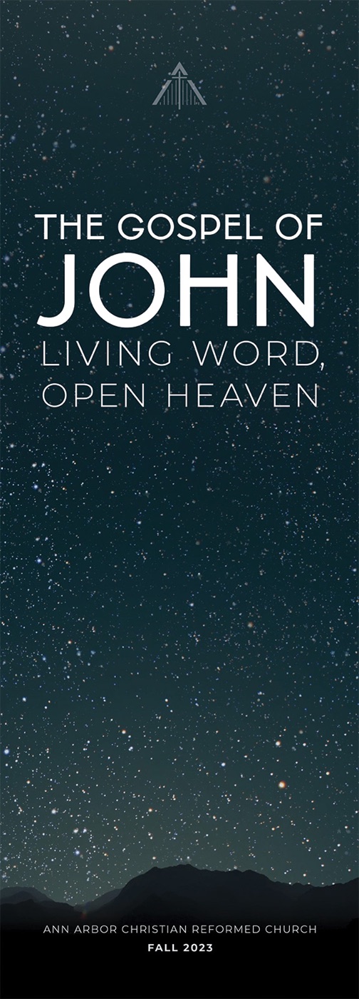
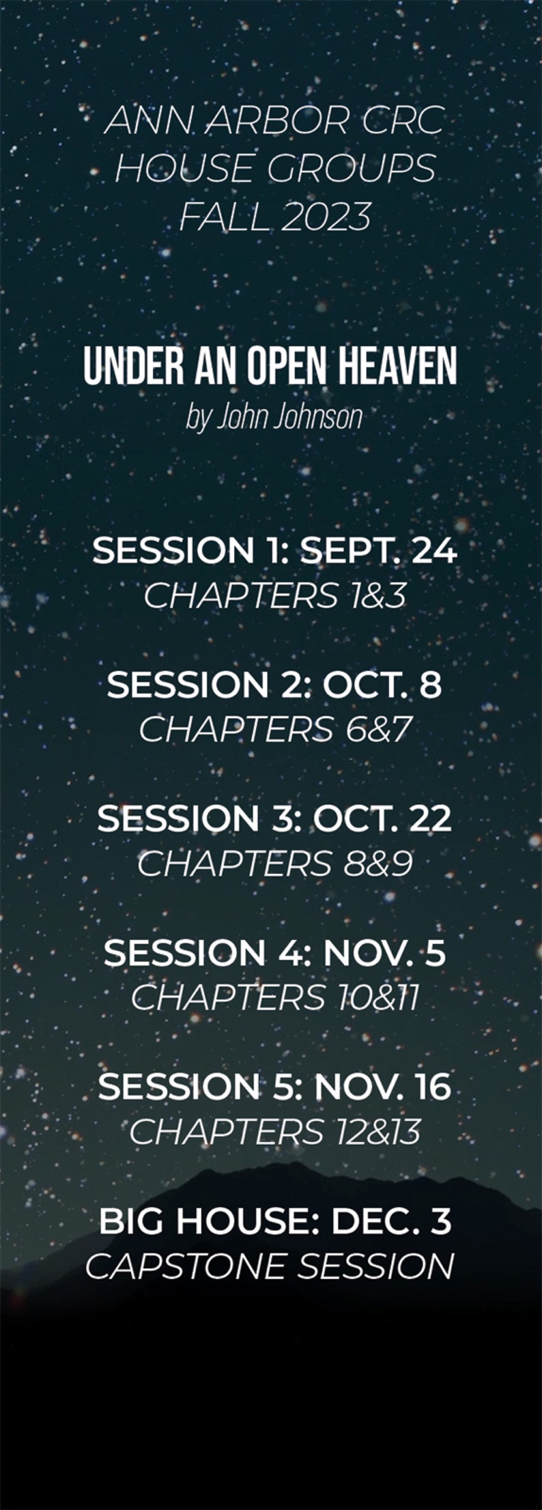
The Gospel of John · Fall 2023
One identity, every touchpoint. A celestial system—star field, thin geometric capitals, an open horizon—templated so it could carry a twelve-week schedule and still reach every corner of the building, from the sanctuary to the hallway to the bookmark in a house-group packet.
Acts: Joining God's Table · 2025
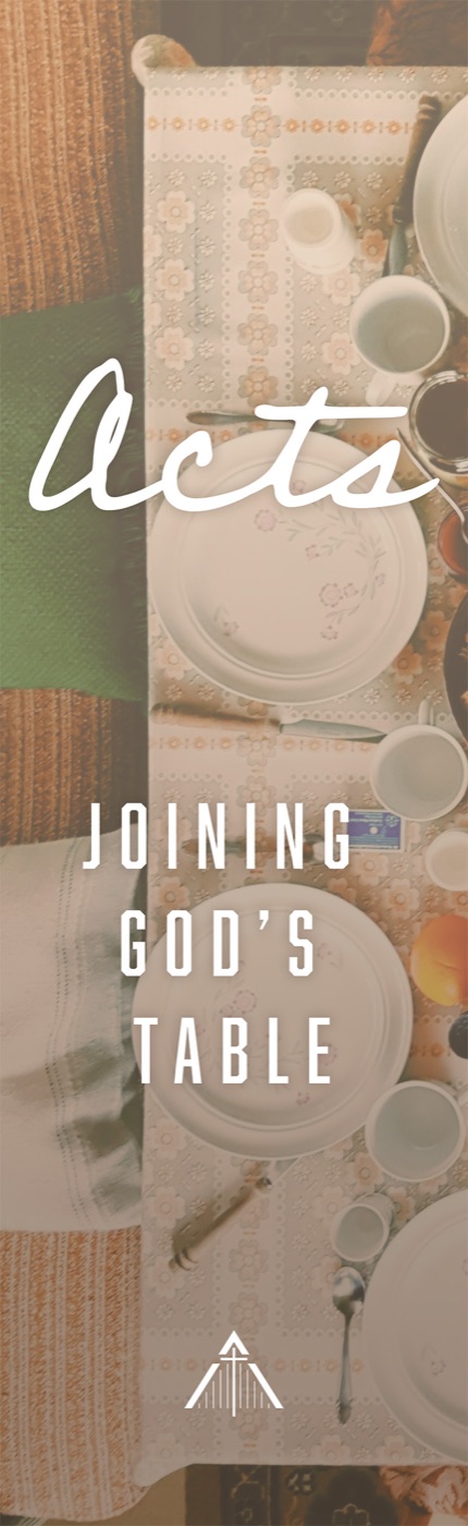
Warmth and range. After the Belhar's high-contrast severity, Acts softened into a hand-scripted wordmark over an overhead shot of a shared table—proof that the institutional mark could anchor a completely different emotional register without losing its throughline.
Tension · Lent
Identity as argument. A Lenten series built on held opposites—doubt and certainty, and the weeks that followed. The artwork slices and layers its imagery into vertical panes that overlap without resolving, behind wide-tracked serif capitals: the visual form makes the season's argument before a word is read. The template carried a different theme, text, and date every week.
Ordinary Time
Restraint as a choice. Ordinary Time is the long green stretch of the church calendar, and the identity matched it: no high-contrast drama, no compressed type—just hand-lettering and a single sunlit forest, held quiet for a whole season. Proof that the system could also get out of the way.
Advent → Epiphany → Easter · One Arc of Light
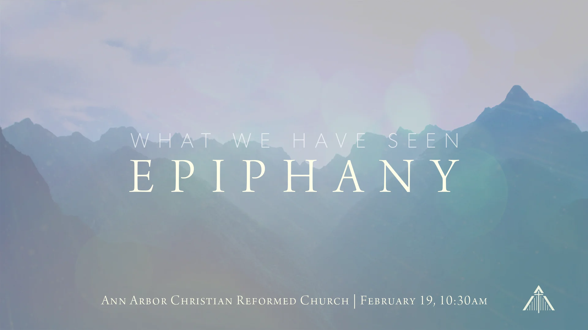
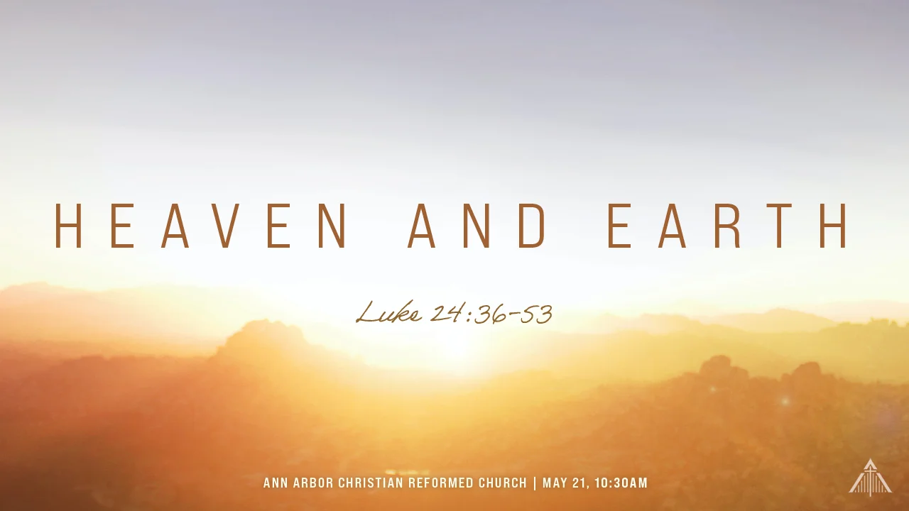
A system with a memory. Most seasonal design treats each season as a discrete project. These three were built as a single continuous progression across five months of the church year: one construction—wide-tracked capitals over a landscape, the text set in a script hand—with the light level rising deliberately from one season to the next.
Advent opens on fog-covered mountains in cold blue, barely lit. Epiphany returns to the same range with the light just arriving. By Easter it's full golden sunrise. A congregation moving through them in order experiences the light increasing over months without ever being told to look for it—the design makes the season's argument structurally, on a timescale longer than any single campaign.
The titles carry the same progression. Advent asks after What God Has Seen; Epiphany answers with What We Have Seen. The seeing moves from God to us as the light comes up—a verbal throughline running underneath the visual one.

What every series shipped with
Sanctuary graphics
Large-format wall art behind the platform, legible from the back pew at sixty feet
Environmental banners
Hall and entry signage read at walking pace
Print & mail
Postcards, bookmarks, and small-group materials
Digital & video
Web graphics, social assets, YouTube thumbnails, and countdown films with original scores
Every one of these series also shipped a five-minute countdown film with an original score—the identity in motion, timed to reach zero exactly as worship began. That work lives on its own page: Video & Original Score →
Distinct enough to feel like a fresh invitation. Disciplined enough to read as one institution.
What This Demonstrates
Sustained creative direction under a real production calendar. Anyone can make one good campaign; this is a body of work—nine identities shown from a practice that ran for years, ranging from high-contrast photographic to hand-scripted to celestial to deliberately quiet, each built as a system that reached every touchpoint from a feed thumbnail to a sanctuary wall read at sixty feet. The Belhar answers whether I can think in systems; Galatians, whether I can carry a concept from metaphor through motion and music; the rest answer whether I can do it again and again without repeating myself.
All of it produced by one person—while also running communications strategy for the institution.