Case Study · 02
Belhar Confession
A four-format visual brand system designed to support a multi-week teaching series on reconciliation, justice, and unity. The strongest example of my campaign design thinking—a single visual identity adapted across print, web, social, and environmental signage.

The Problem
The organization was preparing a multi-week series on the Belhar Confession—a South African church document on reconciliation, justice, and the unity of the church. The content was theologically dense and historically specific. The communications challenge: make it visually compelling and accessible across every touchpoint without flattening the substance.
The Approach
I designed a unified visual identity that could flex across four distinct formats, each with different viewing distances, aspect ratios, and contexts of encounter. Rather than creating four separate designs, I built a modular system: a shared color palette, a consistent typographic hierarchy, and a central image treatment that could be cropped and reframed without losing coherence. The result is a campaign that reads as one voice across every channel.
One identity, four formats
Postcard
6″ × 4″ print · held at arm's length, front and back working as a pair
Web banner
1080px wide · read in a scrolling context alongside competing content
Social graphic
Feed thumbnail · legible at 60px, distinct enough to stop a scroll
Environmental banner
Large-format vinyl · read from thirty feet at walking pace
The Work


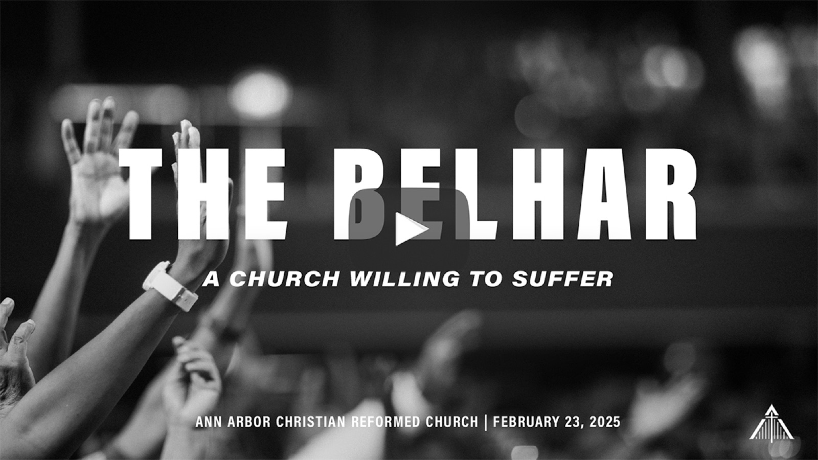
The same identity works at 6 inches and at 6 feet—that's the discipline the system was built to prove.
What This Demonstrates
This project is the clearest example of agency-level campaign design in my portfolio. It shows the ability to build a visual system—not just a single piece—and to maintain brand coherence across radically different formats and viewing contexts.
For a hiring manager evaluating creative direction capability, this is the piece that answers the question: can this person think in systems?