Case Study · 04
Website Redesign
A full website redesign and platform migration from WordPress to Squarespace—managing information architecture, visual design, content strategy, and stakeholder coordination from concept through launch.

The Problem
The existing WordPress site had accumulated years of structural debt: inconsistent page templates, buried navigation, outdated content, and a design that didn't reflect the organization's current identity. The site was functional but not effective; it served people who already knew where to find things and failed everyone else.
So, this redesign required more than a visual refresh. I aimed for three things: a new information architecture, rebuilt from the ground up, a full content audit and rewrite, and a platform that enabled ongoing maintenance by a non-technical team.
The Approach
I chose Squarespace for a specific reason: the Communications Coordinator who would maintain the site day-to-day needed a platform with guardrails. WordPress's flexibility is also its liability for small organizations—it invites inconsistency. Squarespace's template constraints would preserve design integrity after handoff.
Process
Content audit
Every page inventoried, evaluated, and rewritten or retired
Stakeholder interviews
Identified the user journeys that actually mattered
New IA
Navigation rebuilt around those journeys, not the org chart
Design system
Visual language aligned with the organization's broader brand
Photography
The full image library reshot for the new system rather than sourced to fill it
Before & After
The original WordPress site led with a dense photo, a crowded utility menu, and a weekly-bulletin homepage that only made sense to people who already attended. The redesign opens with a single welcoming image, a pared-back five-item navigation, and a clear statement of who the community is—built for the newcomer, not the insider.

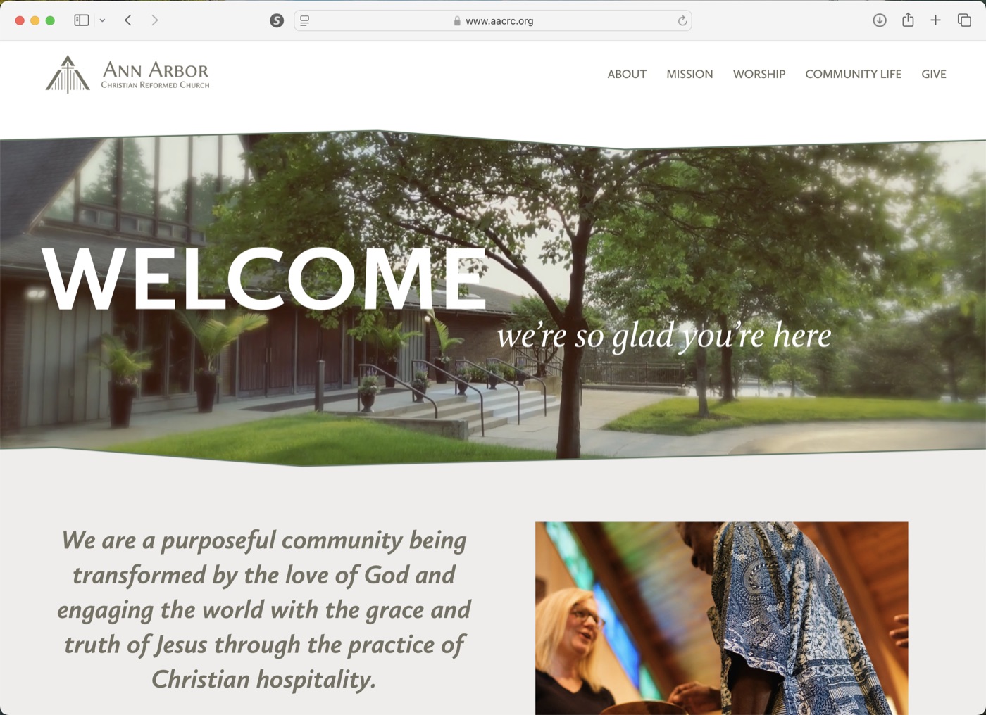
The Photography
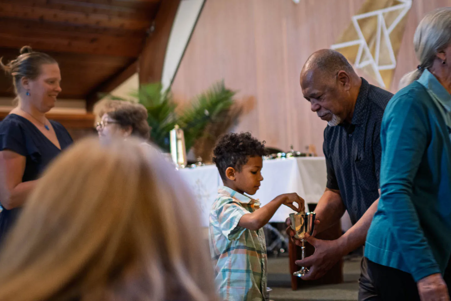
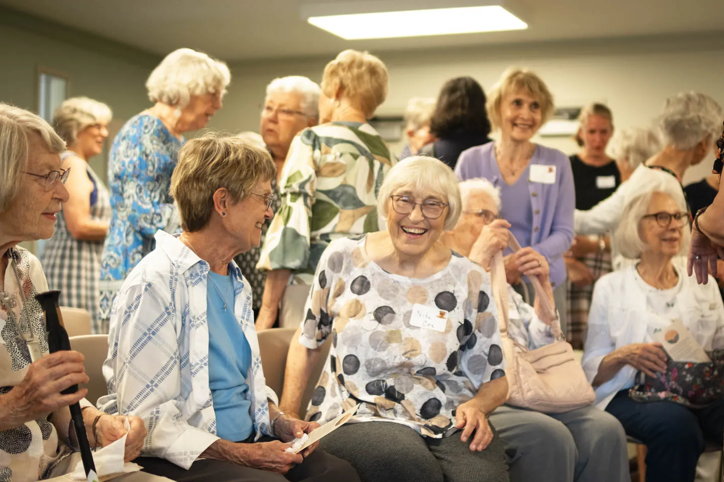
Every photograph on the new site was made for it. The images weren't sourced to fill templates; they were shot for the system—framing, tonality, and crop decided against the layouts they would live in. That's the part of this project that isn't visible as a line item, and it's the part that took the longest. The homepage hero is the one piece in motion rather than stills—a montage I shot most of, though the exterior establishing footage isn't mine.
For the audience this redesign was built for, it isn't a detail. A newcomer deciding whether they'd belong somewhere reads the photographs before the copy, and stock imagery answers that question with people who aren't there. Photographing the actual community was the difference between a site that described the congregation and one that showed it.
All three frames below ran on the launched site: the door, the table, and the room afterward. That's the newcomer's whole arc, and it's the same argument the information architecture was making—built in pictures instead of navigation.

It also left something behind. The organization came out of the project owning a current image library its Communications Coordinator could keep drawing on—the same handoff logic that drove the platform decision, applied to pictures instead of templates.
The System Left the Screen
A redesign that stops at the browser isn't a brand system. The welcome cards shipped alongside the new site carry the same identity into the hand: the torn-banner photo device, the condensed-caps-over-italic-serif lockup, the sage-and-warm-gray palette—and the same opening words a newcomer had already read online, welcome, we're so glad you're here. Someone who visited the site before walking in encountered one continuous voice.

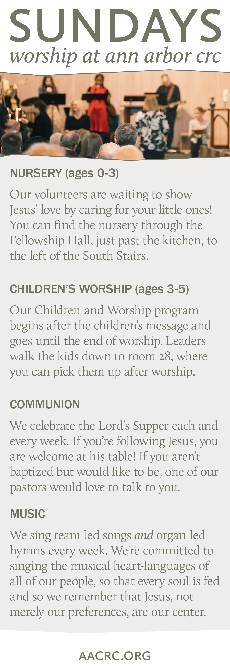
The back is content strategy in miniature—the same newcomer-first thinking that drove the site's information architecture, applied to the four questions a first-time visitor actually has: where do my kids go, am I welcome at communion, what will the music be like, and how do I find out more.
Design Lineage
This wasn't my first website redesign. In 2010, as a graduate student, I pitched and executed a freelance website redesign for Western Theological Seminary. That project—completed fifteen years before this one—establishes a trajectory: the design instincts aren't recent; they've been developing for over a decade.
The platform decision was a maintenance decision. Good handoff design means the site still looks intentional a year after you leave the room.
What This Demonstrates
Web redesign is project management, content strategy, and visual design compressed into a single deliverable. This project shows the ability to manage scope, make platform decisions with long-term maintenance in mind, and execute a design that serves real user needs rather than aesthetic preferences.
The live site is at aacrc.org.